
VITALLY
Fostering health through a Community-driven Gamification Mobile App
Vitally App
A mobile app to help older adults to help facilitate behavioral change through supporting healthy behaviors like proper diet and exercise in its features geared toward social and gamified experiences.
TIME 12 weeks
TYPE Healthcare Client Project
TOOL Sketch | InVision | Adobe Suites
ROLE User Research, UX/UI Design
WORK Project planning, competitive research, user research, storyboarding, prototyping, test protocol development, test facilitation, test data analysis
TEAM Bhavya Sinha, Jiva Capulong, Joshua Hansen
INTRODUCTION
Our project partner, the Regenstrief Institute Lifestyle Learning Lab (L3), is focused on healthy aging in adults and improving chronic diseases such as obesity, type 2 diabetes, and hypertension. They want to develop a mobile application that can empower older adults to make healthy lifestyle changes. Vitally would help facilitate behavioral change through supporting healthy behaviors like proper diet and exercise in its features geared toward social and gamified experiences.
Project Partner
Regenstrief Institute, Inc., an international leader in electronic medical records and health care data integration, is a medical research and development organization focused on improving the quality of care, the efficiency of health care delivery, and enhancing patient outcomes. The Regenstrief Institute, Inc. is a not-for-profit health care research organization located in downtown Indianapolis, Indiana.

Solution Gallery


The Process

Research
The first part of the Vitally project was focused on understanding the target user group and their experiences and attitudes for health-related gamification technology. The target users of Vitally primarily consist of middle-aged to older adults with chronic conditions, three of which we focused on which was obesity, type II diabetes, and hypertension.
While health gamification has become popularized through the availability and accessibility of ubiquitous technologies like smartwatches and health sensor-enabled smartphones on the commercial market, they are commonly associated with younger user demographics. Thus it is important to conduct field research to understand our target demographic’s experiences and attitudes with such technology and specific user requirements that should be addressed in the design of a new product.
To do this, we took an approach of utilizing formative research methods to collect data and then analyze it to understand the challenges and opportunities faced by our target users and frame a problem space to which we would design around.
Observation
User
Interview
Online
Survey
Competitive
Analysis
OBSERVATION
3 observation sessions with Regenstrief were conducted. 1 observation session was conducted over diabetes and hypertension awareness workshop at Eskenazi health center, where experts gave attendees advice and instructions for managing chronic diseases.
2 interviews conducted by UX Researcher at Regenstrief Institute were also observed.

The template took during the workshop observation session. The visitor success story would inspire the mentor/peer feature used in the prototype design
USER INTERVIEW
3 target user participants were interviewed that were recruited from the survey. Questions were asked that expanded on survey responses for more detailed qualitative data (e.g. stories of experience and use)
Target Users: Middle-aged to Older Adults

SURVEY
Surveys were conducted through Google Forms and distributed through Facebook and Reddit. Questions were asked about target users' attitudes and practices with health and technology.
71 responses were gathered.

Survey results when asked about device usage. The majority of participants' usage of mobile phones helps confirm that a mobile app would be the most accessible platform for our target users.
Survey results when asked about what game elements participants enjoyed most. Emphasis on rewards and challenges would lead to them being key features in our app design.

Analysis
For our next step in analyzing our findings, we generated different artifacts including an affinity diagram, a persona, and a journey map. By constructing these artifacts from our field research results they are able to help us understand and represent our target users and identify their key requirements.
AFFINITY MAPPING
We took an inductive, comparative approach by organizing data from our notes by the three main sections we had constructed our interview protocols by and then arranging them through common topics. This way we may utilize this diagram for reference when considering various aspects to our apps’ design (e.g. how might our app address user’s health tracking metrics, or what characteristics would our users look for in an idea app)

The affinity diagram pointed toward these insights:
PERSONAL HEALTH
-
Many chronic conditions overlap, such as having both obesity and diabetes
-
Diet and exercise are a key approach to manage any of the three conditions and can help reduce dependency on medications
TECHNOLOGY USAGE
-
Many older adults own and use personal devices, but the use of them for health purposes is more partial
GAMES for HEALTH
-
Many of the participants had some familiarity with games, playing sometimes or often, usually on mobile apps
-
Popular game elements: challenges, competition, rewards/badges, and personalization
-
Coupons as a proposed incentive
USER PERSONA

USER KEY REQUIREMENTS
After analyzing our findings and the artifacts we produced, we had determined the following key requirements from which to center our design around:
-
Tracking health metrics should be automated as much as possible for convenience as users don’t want to enter them manually
-
It will incorporate challenges, badges, goal setting, and competition.
-
The app should have fun challenges which can help patients to be physically active
-
There should be features that support social motivation such as competition or sharing tips and advice with fellow users


Design & Prototype
After determining our user key requirements from our field research and analysis, we moved into our design and prototyping phase. We began with generative design methods like brainstorming and sketches to explore potential ideas that can address our problem space.
We then chose the most effective and feasible idea to the prototype, from which we then took an iterative prototyping approach, creating a low-fidelity prototype, getting feedback from our stakeholders, and then creating an improved high-fidelity prototype.
We would evaluate our design with user testing, which would inform our design's future steps.
Idea Brainstorm
Scenario
Sketches
Low Fidelity
Paper Prototype
Information
Architecture
High Fidelity
Prototype
BRAINSTORMING
During our brainstorming session, we were able to come up with many ideas that would meet the needs of our users. We narrowed down the 20+ ideas into 3 design concepts that combine multiple ideas into one.
We determined our three design concepts to fill three different categories: an “extreme” idea (Design Concept 1), an “effective” idea (Design Concept 2), and a “feasible” idea (Design Concept 3).
We chose to go forward with Design Concept 3, Health Tinder. The elements of social support, gamification, and automated health tracking lined up with our partner company’s goals.

Brainstormed Ideas on Whiteboard
SCENARIO SKETCH
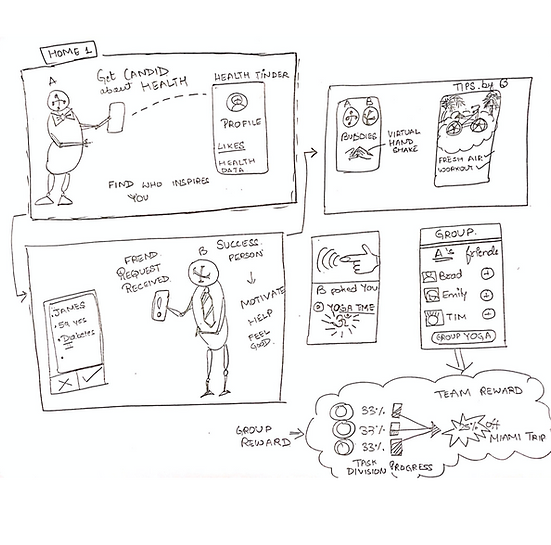
In sketching out the Health Tinder concept further, it is highlighted that the app would allow users to customize options based on their health.
The app would put in place a buddy system that will let users form a support group with peers and mentors. This social support element alone can cover multiple of our design requirements such as health reminders, advice, and feedback facilitated through interactions with peers and mentors.
Health Tinder would also motivate users to reach their goals through team challenges, rewards, and medals. These design elements meet the requirements that users look for in an ideal gamified health app as found in our research, such as having a variety of challenges and coupon-based rewards.

Upon presenting this prototype to our stakeholders, we were given the following feedback:
-
Icons for peer users can be cartoon avatars instead of real photos to work around users feeling conscious or judging each other for their appearance
-
"Suggested peers/mentors" can be shown, similar to "suggestion friends" on Facebook
-
Showing more visual markers and representations of challenge progress can help motivate users in completing their challenges
LOW FIDELITY PAPER PROTOTYPE
INFORMATION ARCHITECTURE

HIGH FIDELITY
//Interactive Prototype
CHALLENGE Interactions & workflow
-
The user goes to the challenge screen.
-
Checks trending challenges.
-
Select an individual challenge.
-
Accept 4 Ltrs H2O in a day challenge.
-
Post that ongoing challenge on his activity feed.
REWARD Interactions & workflow
-
The user goes to the rewards option.
-
Select Healthy eating reward. (Badges gained when successfully completed the eating challenge)
-
Checks recently received Watermelon badge.
-
This badge helps in unlocking the fruit salad badge.
-
Fruit salad badge will fetch Wholefood discount coupon.
-
The user can copy the WF coupon code and redeem it.
SOCIAL NETWORK- PEER & MENTOR Interactions & workflow
-
The user goes to the Peer option on the homepage.
-
The screen will show the user peers he already has added.
-
To add more peer, the user will click on find peer button & swap all the peer options based on his requirement.
-
The user will send a request to the potential peer.
-
The user accepts the connection request
-
Checks the activity feed, which will show his recently added peer's recent activity.

HIGH FIDELITY
//Screens

Sign In Screen

View all the Coupons which you've collected
Badge Confirmation after successfully completing the challenge

View different team challenges

Homescreen

My Challenges Page where you can view all trending challenges as well as challenges you are part of

Ongoing challenge and its details along with the option to invite your friends or directly joining the team challenge

Activity feed where user can view activities of his peers & mentors

User Profile

Swap and select the peer which matches your requirements
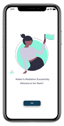
Added to the team challenge confirmation screen
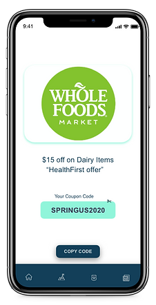
Redeem coupon by copying the coupon code for getting discounts
Evaluation & Validation
The final phase was conducting our user testing with the goal of evaluating the high fidelity prototype with our target users. From this, we seek to determine any potential opportunities for improvement previously overlooked. We sought to test the navigation, readability, and intuitiveness of our app and its core features we had envisioned by having the participants go through a number of tasks and giving feedback and collecting a number of usability metrics throughout the test to be analyzed to help us inform our future steps.
PROCEDURE
Interviews were done with the use of the prototype on a mobile phone. Participants were asked to complete the following four tasks, from which our prototype screens were designed to be structured around:
Task 1
-
Scenario: You notice that you have been notified of receiving a peer request. You are interested in adding new peers to follow on your activity feed.
-
Scenario: Now that you have added your peer, you want to see what they are up to. Look for their activity on the activity feed.
Task 2
-
Scenario: You want to build a habit of meditation to manage your stress and know some friends on Facebook who would like to as well. Look for a group challenge about meditation for you and your friends to join.
Task 3
-
Scenario: You currently have a 50K steps group challenge that is still ongoing and would like to view your group’s progress. If there are any teammates lagging behind, you want to get them to catch up.
Task 4
-
Scenario: After completing some challenges, you want to see what badges you earned and to redeem any rewards you have earned. View your badges and see if you have any rewards to redeem.
SUS- System Usability Scale
Our prototype's performance on the System Usability Scale (SUS) survey data rating scores at a B rating of 75, above the industry average of 68.
PROS
-
The style and graphics of the prototype were seen as appealing to users
-
The badge-coupon rewards were seen as an attractive incentive
-
The visible challenge progression and group member accountability looked like a helpful tool for motivation
CONS
-
Some consistency and clarity issues with button labeling
-
Some confusion about UI graphics and navigation (e.g. an image appears to be slidable but isn't.
-
Badge and coupon redemption system was confusing and unclear
POTENTIAL IMPROVEMENTS
Potential immediate improvements for reworking the prototype design based on feedback and suggestions include:
1. Clearly highlighted and readable buttons
-
Participants found readable text labels and blue highlighted buttons helpful
2. Notification system for peer requests
-
Users want a centralized location for incoming requests and reminders
3. Rework badge navigation and labels
-
Simplify the navigation to the badge page and the “health badges” label to just “badges”
4. Highlight collectible badges
-
When a new badge is collectible, it will be featured prominently with a teal glow to catch the user’s attention
5. Clearer badge-coupon redemption system
-
Make coupon rewards more prominent with a clearer label exchanging them for badges
6. Help/tutorial pop-up button
-
Participants expressed the need for a help button for first-time users to learn
FUTURE STEPS
Next steps for potential further phases of this project include:
1. Second iteration high-fidelity prototype
-
Make changes based on potential improvements from user testing feedback
2. The second round of user testing
-
Conduct 3-4 more usability tests with participants that fit the ideal target user profile
3. Smartwatch integration and screens
-
We envisioned our app to have smartwatch compatibility, due to their robust sensor health data measuring capabilities